

Posted in Software & Development
November 16, 2023
Configuring Drupal & React/TypeScript Components
Determining fields, types, and component choices.
Imagine a world where the frontiers between Drupal and React intertwine seamlessly, creating a digital experience as fluid as it is robust. Mike Hubbard guides you through aligning Drupal's backend prowess with React's dynamic frontend capabilities. Discover how to configure Drupal fields that resonate with React components and vice versa, ensuring a symphony of data and design.
Decoupling the front end and back end of a website or any platform comes with unique challenges. One of those challenges is matching frontend UI components to the backend field data, especially when you might not be very familiar with the backend side.
This article covers pairing up a Drupal backend and React frontend UI components written in TypeScript and, more specifically, how you can use one to help with the other. I’ll cover two situations:
- You have Drupal configured; now you need to build a matching React component.
- You have a React component; now, you need to configure the Drupal UI.
While this article uses Drupal as the CMS (content management system) backend, the information here should generally apply to any customizable platform with configurable fields.
Starting with Drupal
You have Drupal configured; now you need to build a matching React component.
Drupal is a very flexible CMS (content management system). One of its flexibilities is that you can configure fields for any type of data that you need. So, for example, if you need the content creators to enter a title, you can create a plain text field for them to use. If you need a body of text, you can create a long text field that includes a text editor so that content creators can include headings, images, links, and other text formatting options. There are field types for any type of data that you need.
One of the systems we use for setting up pages that content creators will use includes a module called Paragraphs. This lets us configure a collection of single-purpose UI elements that content creators might use to build a page, things like rich text, accordions, cards, buttons, etc. They can add these elements in any order to build a page.
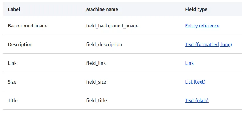
Drupal component field configuration
Looking at Drupal, the configuration for one of these components would look something like this:
Paragraph component fields in Drupal
The first column gives you a human-friendly label for the field, the second column is the machine name you would see when using the data, and the third field shows the type of field used. The third column is key here.
Matching our React component types
Switching gears, now let’s take a look at how we might set up the types for a new React component to match our data. Our types might look something like this:
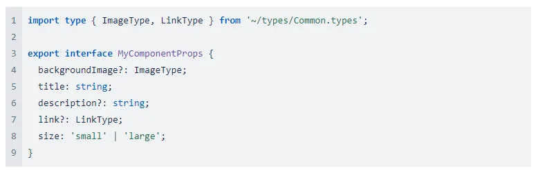
We can use Drupal to determine our types.
- The background image field is referencing an image media entity that has common image information such as the image path (string), dimensions (number), alt text (string), etc., so we can include a common Media type that includes all of that.
- The title is a plain text field, so we set it as a string.
- The description is a long, formatted text field (text editor) that gets sanitized and exported as a string of HTML, so we set that as a string.
- The link is a field with common link information such as the URL (string), title (string), etc., so we can include a common Link type.
- The size field is a list of text options, so we can include those specific string options.
Required types
In Drupal, we can click on any of those fields to edit them and see additional settings for the field. The important setting to consider here is a checkbox indicating whether or not the fields are required by content creators. We can use that to determine if any of our types should be required.
Choosing the right components
I want to touch on one last important piece to consider when building the frontend component: component choice within your component.
We use a design system that is based on and extends MUI. When dealing with text string data, you want to make sure that you’re using the right component for rendering that data.
In this example, the title is a plain text string. Because it’s plain text, it has no HTML formatting. We would want to use our <Typography> component to render this text so that we can control what the text looks like (i.e. paragraph, heading, etc.).
Our description field is also a string, but it DOES include HTML since it is a formatted text field. If you tried to use the <Typography> component, you would see a console warning once rendered. This is because you would likely have nested paragraphs, which is not allowed in HTML. In this case, you would instead use the <NativeHTML> component, which was designed to support a string of HTML and includes styling to make the typography appear the same as the <Typography> component.
Next steps
Now that we know our data, have set up our types, and are thinking about component choice, we can continue to build out the frontend component and map the API data to it!
Starting with React
You have a React component. Now, you need to configure the Drupal UI.
If you are working with an existing UI component written in TypeScript or are building a new one, at some point, you may need to configure the Drupal backend so that content creators can use the new component when building out their content. Let’s see how we can use our component to determine our fields in Drupal.
Using our types to determine our needs
For this example, let’s use the same type from earlier in this article:
Looking at the example, we can immediately see some important details about the data that we will need to capture in Drupal.
- backgroundImage will need to include image information.
- title and description will both be text fields, but the title is required.
- link will be a link field.
- size has two very specific options. It is also required.
Configuring fields in Drupal to match our type data
If you’re not very familiar with Drupal, read the Starting with Drupal introduction above to get a quick overview of what it can do.
In essence, Drupal is a good match in a decoupled setting because we can configure specific field types to match the data that the frontend component requires. We can also use a module called Paragraphs, which allows us to collect a group of fields that we would need for an individual UI component that content creators can then use to build a page, think rich text, accordions, cards, buttons, etc.
Assuming you already have a base set of Paragraphs available to content creators and your goal now is to configure a new one to match your component, in Drupal, you would create a new Paragraph by going to /admin/structure/paragraphs_type and clicking the add paragraph type button. You would give it a name and a description to match your component.
Next, we move on to configuring the individual fields that make up the component. You will see an add field button to start this process. Let's go through each of our component types.
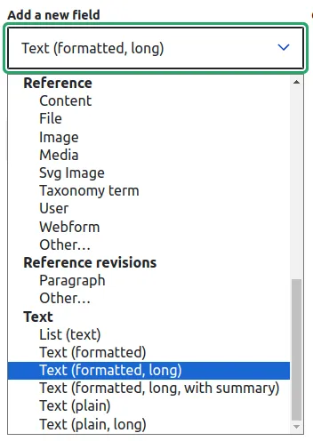
- backgroundImage
Drupal contains a media library for holding types of media, including images, documents, audio, video, etc. We would choose the “Media” reference and select Image to allow our users to upload images.
- title and description
This is where you need to consider the type of data that your content supports. Let’s say that your title renders as an H2 heading using the <Typography>component. You don’t want any extra HTML added inside of that heading, so a simple plain text field is what you would want in Drupal. However, the description might be different. Say you DO expect content creators to be able to format the description text, add links, images, etc., and so you’re component uses <NativeHTML>, which allows this. In this case, your description field would likely be a formatted long text field (that includes a text editor).
- link
Drupal’s link field would be the obvious choice for this. It allows content creators to add a URL, title, etc.
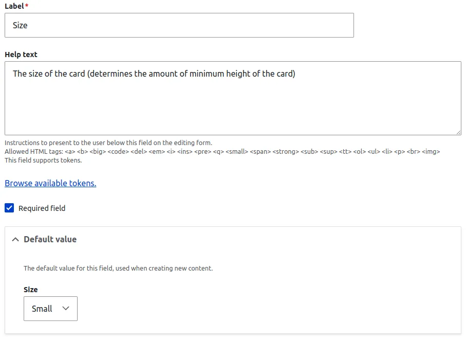
- size
Because the size type has two specific options, small and large, we need to restrict the options available to content creators. Drupal’s text list field is ideal for this. It lets you provide a specific list of options that you can configure to match your types.
Tuning the UI for content creators
When configuring each of your fields, use your types and component defaults as a reference. In our example component, the title and size props are required. Drupal fields can be set as required by simply checking a box.
You can also pre-set the default content for the field. So if the size field should be small by default, set it as that.
While you’re there, make sure to add help text so that the end-user can fully understand what it is that they are doing. How we configure the UI greatly impacts the experience of the content creators using it, so don’t forget about them!
Text list field default settings
Next steps
Now that we have our React component and a matching Paragraph in Drupal, all we need to do now is finish any remaining Drupal configuration to use it, export the configuration, and do any API and plugin work needed to map the data to the frontend component. This process will be different for different teams and projects, but those are the general next steps.
Wrapping up
I hope this provides some insight into how we as developers can use React, TypeScript, and Drupal to our advantage when starting with one or the other. The front end and back end are deeply connected, so the better we understand how they work together, the better we can create a seamless experience.
Interested in the future of web development?
Want to know more about the world-class development tools we use at Acro Commerce?
Fill in the form below, and one of our subject matter experts will reach out.
